 |
| Iconic Batman logo |
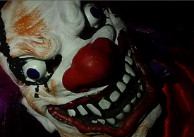
Therefore, we chose the photo of the extreme close up of the clown mask as the image that would be iconic and instantly identifiable.
 |
| Image of the clown mask |
 |
| Scream 4 |
 |
| Smiley |
 |
| Screenshot from the trailer |
Although, the image of the clown mask is one that we took on a photoshoot for our poster and website, there is a very similar extreme close up shot at the end of our trailer. We think that our poster is simplistic and so easier for the audience to remember as the image of the clown stands out and is the main feature. Additionally, we feel that our poster does not reveal anything about what actually happens in the film, apart from that it involves a clown. This is good when paired with our trailer as the trailer gives slightly more away than the poster.
Our poster and website are almost exactly the same, creating a strong link between the two, and therefore, again, making them more memorable.
 |
| Final website |
 |
| Final poster |
The website does not reveal much of the narrative of the
film, but has the trailer embedded into it, so that the viewer of the website
can watch it. The trailer is on autoplay so that as soon as the page loads the
trailer starts playing, making sure that they are aware of the trailer and
gives them more information on the actual narrative of the film.
Another feature that links our trailer and ancillary tasks
together, is the font. We spent a long time finding and deciding on the right
font and eventually chose Extrakrebel 1987. We felt that this font was right
for our film as it has creepy feel to it and fits well with the theme.
Additionally, we think that it fits well as the clown stalks his victims before
he kills them, and the x’s through the o’s could symbolize the killer crossing
them off his list as he murders them.
 |
| Font we chose |
The trailer and both the poster and website are fairly dark,
adding to the horror genre. Low-key lighting is common in horror films and
promotional packages, such as The Woman In Black and Mama (see below), and
we think that we have used this well and to our advantage, to convey the horror
genre but also to create mystery around the clown character. It also links to
the theme of adolescence as we have used a strobe light in our trailer to
create the party scene but this links back to the horror genre as, although the
characters look as though they are having a good time, you do not know what
will appear after the screen flashes back up from being black. We played on
this in our trailer by making the clown face appear in an extreme close up at
the end, which appears at the same time as a crescendo in the music.
The combination of our main product and ancillary tasks are effective as they all feature the same, recognizable image of the clown mask, which the audience would instantly recognize from the film ‘Coulrophobia’. We also managed to keep the same style throughout, by using the same fonts and images, creating a common theme between them all. The trailer and ancillary tasks reflect the genre of our film well, making the audience members aware of the genre and therefore making it more effective.
The combination of our main product and ancillary tasks are effective as they all feature the same, recognizable image of the clown mask, which the audience would instantly recognize from the film ‘Coulrophobia’. We also managed to keep the same style throughout, by using the same fonts and images, creating a common theme between them all. The trailer and ancillary tasks reflect the genre of our film well, making the audience members aware of the genre and therefore making it more effective.


No comments:
Post a Comment